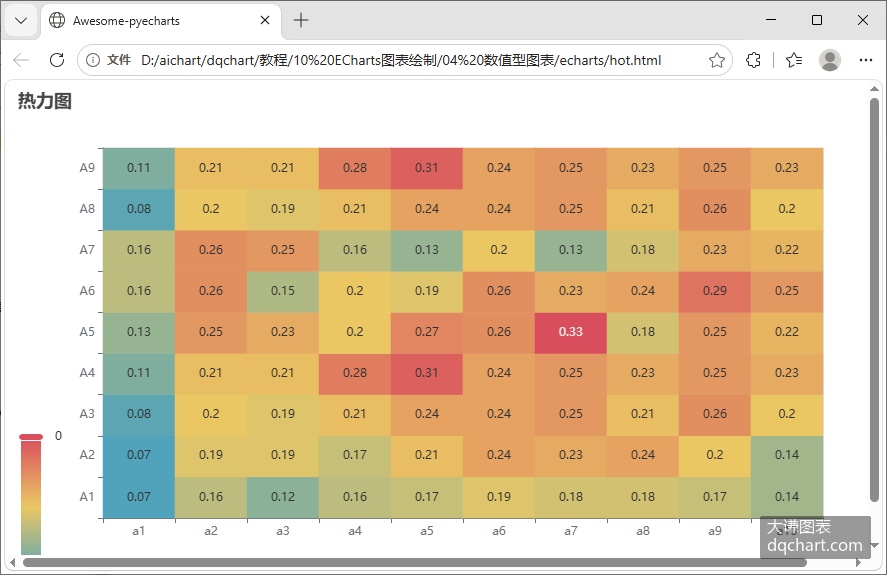
热力图是矩阵数据可视化的一种图表类型。给定一个颜色查找表,用矩阵的最小值映射色条底端颜色,用矩阵最大值映射色条顶端颜色,中间的数据通过线性插值从颜色查找表中获取颜色,这样,矩阵中的每个元素都有唯一的颜色对应。用颜色绘制方块图或圆圈图,就得到热力图。

\[\]
根据给定数据绘图,编写pyECharts代码如下所示:
code.python
import pandas as pd
from pyecharts.charts import HeatMap
from pyecharts import options as opts
import numpy as np
df=pd.read_excel('4 热力图.xlsx',engine='openpyxl',index_col=0)
m,n=df.shape
categories = df.index.tolist()  # 索引列作为横轴
names=df.columns
# 1. 创建热力图
hm = HeatMap()
hm.add_xaxis(categories)
# 2. 动态添加所有数据
data=[]
for i in range(m):
    for j in range(n):
        data.append([i,j,df.iloc[i,j]])
hm.add_yaxis('',names.tolist(),data,label_opts=opts.LabelOpts(is_show=True, position="inside"))
# 3. 配置图表
hm.set_global_opts(
    title_opts=opts.TitleOpts(title="热力图"),
    visualmap_opts=opts.VisualMapOpts(type_="color",
            min_=df.min().min(),
            max_=df.max().max()))
hm.render("hot.html")
运行代码,生成下图。
\[\]