散点图常用来表现两组数据之间的相关关系。散点图的两个坐标轴都是数值轴。
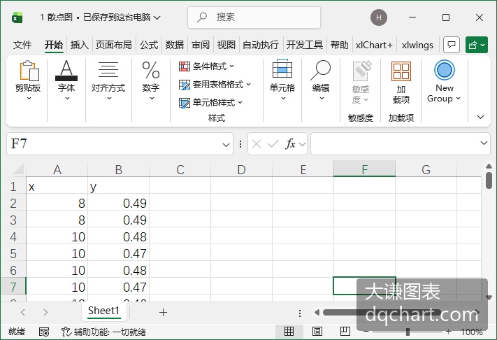
\[\]
根据给定数据绘图,编写pyECharts代码如下所示:
code.python
import pandas as pd
from pyecharts.charts import Scatter
from pyecharts import options as opts
df=pd.read_excel('1 散点图.xlsx',engine='openpyxl')
names=df.columns.tolist()
# 1. 创建散点图
scatter = Scatter()
scatter.add_xaxis(xaxis_data=df[names[0]].tolist())
# 2. 动态添加所有数据系列
scatter.add_yaxis('',y_axis=df[names[1]].tolist(),
        symbol_size=20,
        label_opts=opts.LabelOpts(is_show=False))
# 3. 配置图表
dif=max(df[names[1]].tolist())-min(df[names[1]].tolist())
scatter.set_series_opts()
scatter.set_global_opts(
        xaxis_opts=opts.AxisOpts(
            type_="value", splitline_opts=opts.SplitLineOpts(is_show=True)
        ),
        yaxis_opts=opts.AxisOpts(
            type_="value",
            min_=min(df[names[1]].tolist())-dif/10,
            axistick_opts=opts.AxisTickOpts(is_show=True),
            splitline_opts=opts.SplitLineOpts(is_show=True),
        ),
        tooltip_opts=opts.TooltipOpts(is_show=False),
    )
scatter.render("scatter.html")
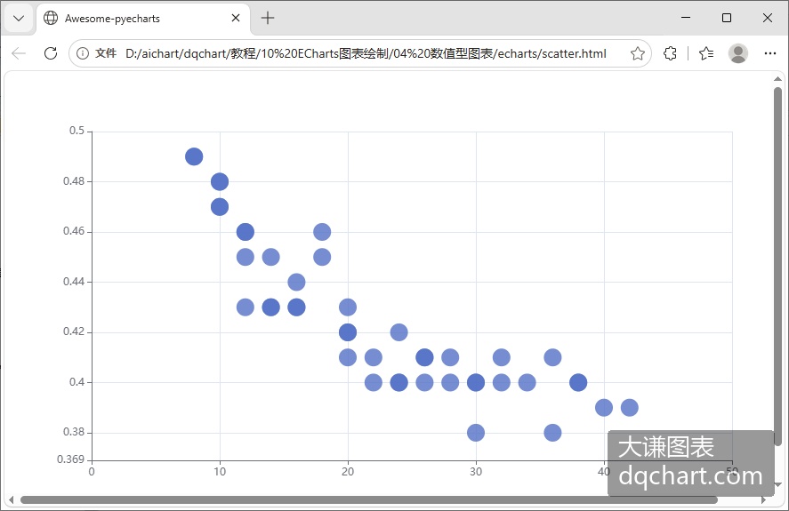
运行代码,生成下图。
\[\]