点图用一组或多组点表示向量或矩阵定义的数据。点图有一个坐标轴表示分类数据,可以是横轴,也可以是纵轴。横轴为分类轴时称为点图,纵轴为分类轴时常称为滑珠图。后面介绍的散点图也是用点集表示点数据,但它的横轴和纵轴都是数值轴,两种图的作用也完全不同。点图的特点是简洁明了。[大谦Excel,dqexcel点com]
简单点图
简单点图用孤立的点表示向量定义的数据。可以设置和修改点的标记类型、颜色和大小等属性。Excel中通过绘制点线图并隐藏折线,或者绘制散点图,或者逐个绘制点都可以实现点图的绘制。
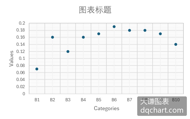
图3-1 简单点图
本例绘制点线图并隐藏折线来实现点图的绘制。完整代码见:Samples->ch06 分类型图表->01 简单点图->py.py。
import xlwings as xw    #导入xlwings包
import os    #导入OS包
root=os.getcwd()    #获取当前工作路径
app=xw.App(visible=True,add_book=False)    #创建Excel应用
wb=app.books.open(root+r'/data.xlsx',read_only=False)    #打开数据文件返回工作簿对象
sht=wb.sheets('Sheet1')    #获取指定工作表对象
sht.api.Range('A2:B11').Select()  #数据
shp=sht.api.Shapes.AddChart2(-1, xw.constants.ChartType.xlLineMarkers, 20, 20, 300, 200, True)
cht=shp.Chart    #获取图表
cht.SeriesCollection(1).Format.Line.Visible=False    #隐藏折线
运行代码生成图3-1。
复合点图
复合点图用多组不同颜色的点图表示多组分类数据。
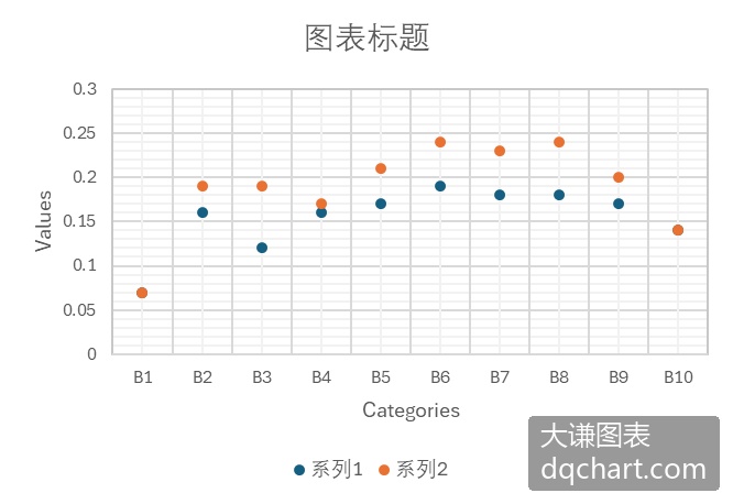
图3-2 复合点图
下面用Excel文件data.xlsx中的数据绘制复合点图。完整代码见:Samples->ch06 分类型图表->02 复合点图->py.py。
#... 省略部分代码
sht.api.Range('A2:C11').Select()  #数据
shp=sht.api.Shapes.AddChart2(-1, xw.constants.ChartType.xlLineMarkers, 20, 20, 300, 220, True)
cht=shp.Chart    #获取图表
cht.SeriesCollection(1).Format.Line.Visible=False    #隐藏折线
cht.SeriesCollection(2).Format.Line.Visible=False    #隐藏折线
运行代码生成图3-2。
滑珠图
滑珠图实际上是交换x轴和y轴后的点图。此时y轴变成了分类轴,x轴变成了数值轴。简单滑珠图用一组点表现一组数据。
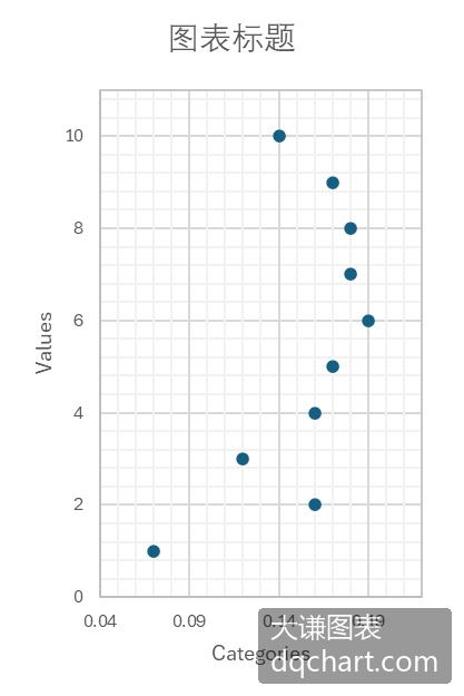
图3-3 滑珠图
下面用Excel文件data.xlsx中的数据绘制滑珠图。完整代码见:Samples->ch06 分类型图表->03 滑珠图->py.py。
#... 省略部分代码
sht.api.Range('B2:C11').Select()  #数据
shp=sht.api.Shapes.AddChart2(-1,xw.constants.ChartType.xlXYScatter,30,20,200,300,True)
cht=shp.Chart    #获取图表
#横轴和纵轴取值范围的最小值和最大值
cht.Axes(1).MinimumScale=0.04
cht.Axes(1).MaximumScale=0.22
cht.Axes(2).MinimumScale=0
cht.Axes(2).MaximumScale=11
运行代码生成图3-3。
复合滑珠图
复合滑珠图用多组滑珠表示多组分类数据,y轴是分类轴,x轴是数值轴。复合点图需要添加图例对各组点所表示的意义进行说明。
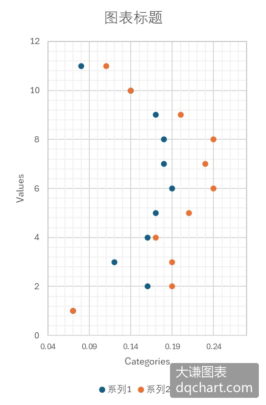
图3-4 复合滑珠图
下面用Excel文件data.xlsx中的数据绘制复合滑珠图。完整代码见:Samples->ch06 分类型图表->04 复合滑珠图->py.py。
#... 省略部分代码
sht.api.Range('B2:C12').Select()  #数据
shp=sht.api.Shapes.AddChart2(-1, xw.constants.ChartType.xlXYScatter, 30, 20, 230, 380, True)
cht=shp.Chart    #获取图表
#清空序列
count=cht.SeriesCollection().Count
if count>0:
    for i in range(count,0,-1):
        cht.SeriesCollection(i).Delete()
cht.SeriesCollection().NewSeries()    #新建序列
cht.SeriesCollection(1).ChartType=xw.constants.ChartType.xlXYScatter    #图表类型为散点图
cht.SeriesCollection(1).XValues=sht.api.Range("B2:B12")
cht.SeriesCollection(1).Values=sht.api.Range("D2:D12")
cht.SeriesCollection().NewSeries()    #新建序列
cht.SeriesCollection(2).ChartType=xw.constants.ChartType.xlXYScatter    #图表类型为散点图
cht.SeriesCollection(2).XValues=sht.api.Range("C2:C12")
cht.SeriesCollection(2).Values=sht.api.Range("D2:D12")
#横轴和纵轴取值范围的最小值和最大值
cht.Axes(1).MinimumScale=0.04
cht.Axes(1).MaximumScale=0.28
cht.Axes(2).MinimumScale=0
cht.Axes(2).MaximumScale=12
运行代码生成图3-4。
分区滑珠图
分区滑珠图将同一序列的滑珠绘在同一个分区,如图3-5所示,图中共有2个分区。
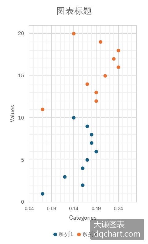
图3-5 分区滑珠图
下面用Excel文件data.xlsx中的数据绘制分区滑珠图。完整代码见:Samples->ch06 分类型图表->05 分区滑珠图->py.py。
#... 省略部分代码
sht.api.Range('B2:C11').Select()  #数据
shp=sht.api.Shapes.AddChart2(-1, xw.constants.ChartType.xlXYScatter, 30, 20, 230, 380, True)
cht=shp.Chart    #获取图表
#清空序列
count=cht.SeriesCollection().Count
if count>0:
    for i in range(count,0,-1):
        cht.SeriesCollection(i).Delete()
cht.SeriesCollection().NewSeries()    #新建序列
cht.SeriesCollection(1).ChartType=xw.constants.ChartType.xlXYScatter    #图表类型为散点图
cht.SeriesCollection(1).XValues=sht.api.Range("B2:B11")    #横轴数据
cht.SeriesCollection(1).Values=sht.api.Range("D2:D11")    #纵轴数据
cht.SeriesCollection().NewSeries()    #新建序列
cht.SeriesCollection(2).ChartType=xw.constants.ChartType.xlXYScatter    #图表类型为散点图
cht.SeriesCollection(2).XValues=sht.api.Range("C2:C11")    #横轴数据
cht.SeriesCollection(2).Values=sht.api.Range("E2:E11")    #纵轴数据
#横轴和纵轴取值范围的最小值和最大值
cht.Axes(1).MinimumScale=0.04
cht.Axes(1).MaximumScale=0.28
cht.Axes(2).MinimumScale=0
cht.Axes(2).MaximumScale=21
运行代码生成图3-5。
哑铃图
哑铃图如图2-10所示,将有2个序列的复合滑珠图中同一个分组的滑珠用直线段连接,就是哑铃图。该图形如一组哑铃,故而得名。
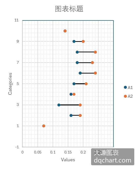
图3-6 哑铃图
下面用Excel文件data.xlsx中的数据绘制哑铃图。完整代码见:Samples->ch06 分类型图表->06 哑铃图->py.py。
import xlwings as xw    #导入xlwings包
import numpy as np    #导入NumPy包
import os    #导入OS包
def draw_rnd_scatter(cht,x,y,r,g,b):
    '''绘制散点图
    ser=cht.SeriesCollection().NewSeries()    #新建序列
    ser.ChartType=xw.constants.ChartType.xlXYScatter    #图表类型为散点图
    ser.XValues=x    #横轴数据
    ser.Values=y    #纵轴数据
    ser.Format.Line.ForeColor.RGB=xw.utils.rgb_to_int((r,g,b))
    ser.Format.Fill.ForeColor.RGB=xw.utils.rgb_to_int((r,g,b))
    ser.MarkerSize=6
root=os.getcwd()    #获取当前工作路径
app=xw.App(visible=True,add_book=False)    #创建Excel应用
wb=app.books.open(root+r'/data.xlsx',read_only=False)    #打开数据文件返回工作簿对象
sht=wb.sheets('Sheet1')    #获取指定工作表对象
shp=sht.api.Shapes.AddChart2()    #创建空白图表
shp.Left=20    #图表位置和大小
shp.Top=20
shp.Width=250
shp.Height=320
cht=shp.Chart    #获取图表
cht.ChartType=xw.constants.ChartType.xlXYScatter    #图表类型为散点图
ax1=cht.Axes(1)    #获取横轴
ax2=cht.Axes(2)    #获取纵轴
ax1.MinimumScale=0    #横轴最小值
ax1.MaximumScale=0.25
ax2.MinimumScale=0    #纵轴最小值
ax2.MaximumScale=11
set_style(cht)    #设置样式
data=sht.range('B2:D11').value    #获取数据
dt=np.transpose(data)    #转置
dt1=dt[0]    #获取分组数据
dt2=dt[1]
dt3=dt[2]
#绘线形图
for i in range(10):
    ser=cht.SeriesCollection().NewSeries()    #新建序列
    ser.ChartType=xw.constants.ChartType.xlXYScatterLinesNoMarkers
    ser.XValues=[dt1[i],dt2[i]]
    ser.Values=[dt3[i],dt3[i]]
    ser.Format.Line.ForeColor.RGB=xw.utils.rgb_to_int((0,0,255))
    ser.Format.Line.Weight=1.5
#绘散点图
draw_rnd_scatter(cht,dt1,dt3,0,0,255)
draw_rnd_scatter(cht,dt2,dt3,255,128,0)
运行代码生成图3-6。
火柴杆图
火柴杆图在点图的基础上添加数据点到坐标轴的垂线。如果垂线是点到x轴的垂线,则火柴杆图是垂直的;如果垂线是点到y轴的垂线,则火柴杆图是水平的,如图3-7所示。
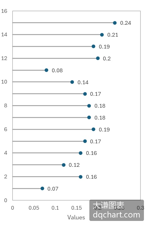
图3-7 火柴杆图
下面用Excel文件data.xlsx中的数据绘制火柴杆图。完整代码见:Samples->ch06 分类型图表->07 火柴杆图->py.py。
import xlwings as xw    #导入xlwings包
import numpy as np    #导入NumPy包
import os    #导入OS包
def draw_rnd_scatter(cht,x,y,r,g,b):
    ser=cht.SeriesCollection().NewSeries()    #新建序列
    ser.ChartType=xw.constants.ChartType.xlXYScatter    #图表类型为散点图
    ser.XValues=x    #横轴数据
    ser.Values=y    #纵轴数据
    ser.Format.Line.ForeColor.RGB=xw.utils.rgb_to_int((0,0,0))    #散点边线的颜色
    ser.Format.Fill.ForeColor.RGB=xw.utils.rgb_to_int((r,g,b))    #散点填充色
    ser.MarkerSize=6    #散点大小
root=os.getcwd()    #获取当前工作路径
app=xw.App(visible=True,add_book=False)    #创建Excel应用
wb=app.books.open(root+r'/data.xlsx',read_only=False)    #打开数据文件返回工作簿对象
sht=wb.sheets('Sheet1')    #获取指定工作表对象
shp=sht.api.Shapes.AddChart2()    #创建空白图表
shp.Left=20    #图表的位置和大小
shp.Top=20
shp.Width=220
shp.Height=320
cht=shp.Chart    #获取图表
cht.ChartType=xw.constants.ChartType.xlXYScatter    #图表类型为散点图
ax1=cht.Axes(1)    #获取横轴
ax2=cht.Axes(2)    #获取纵轴
ax1.MinimumScale=0    #横轴最小值
ax1.MaximumScale=0.3
ax2.MinimumScale=0    #纵轴最小值
ax2.MaximumScale=16
set_style(cht)    #设置样式
data=sht.range('B2:C16').value    #获取数据
dt=np.transpose(data)    #转置
dt1=dt[0]    #获取分组数据
dt2=dt[1]
#绘线形图
for i in range(15):
    ser=cht.SeriesCollection().NewSeries()    #新建序列
    ser.ChartType=xw.constants.ChartType.xlXYScatterLinesNoMarkers
    ser.XValues=[0,dt1[i]]
    ser.Values=[dt2[i],dt2[i]]
    ser.Format.Line.ForeColor.RGB=xw.utils.rgb_to_int((0,0,255))
    ser.Format.Line.Weight=1
#绘散点图
draw_rnd_scatter(cht,dt1,dt2,0,0,255)
#不显示图例
cht.HasLegend=False
运行代码生成类似图3-7的图表。
棒棒糖图
棒棒糖图与火柴杆图的区别在于前者的圆形点标记更大,而且常常将数据标签放在标记内部,如图3-8所示。
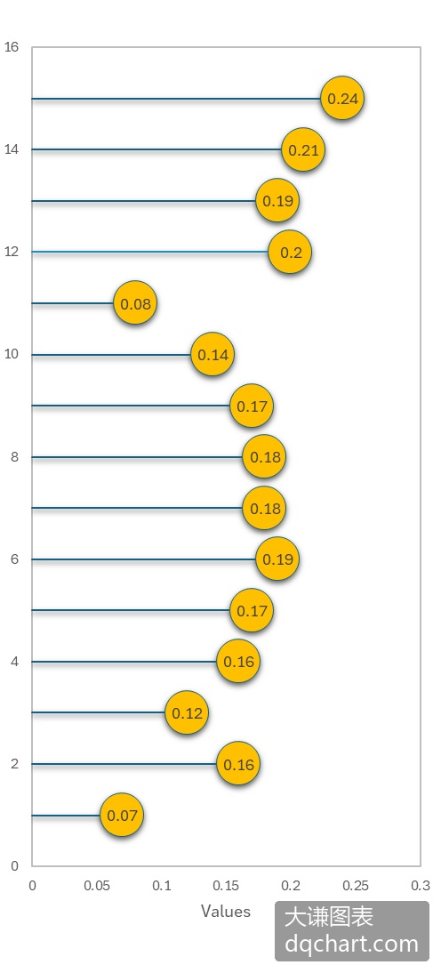
图3-8 棒棒糖图
下面用Excel文件data.xlsx中的数据绘制棒棒糖图。完整代码见:Samples->ch06 分类型图表->08 棒棒糖图->py.py。
import xlwings as xw    #导入xlwings包
import numpy as np    #导入NumPy包
import os    #导入OS包
def draw_rnd_scatter(cht,x,y,n,r,g,b):
    '''绘制散点图
    x: X坐标    y(0 to n-1): Y坐标
    '''
    ser=cht.SeriesCollection().NewSeries()    #新建序列
    ser.ChartType=xw.constants.ChartType.xlXYScatter    #图表类型为散点图
    ser.XValues=x
    ser.Values=y
    ser.Format.Line.ForeColor.RGB=xw.utils.rgb_to_int((0,0,0))
    ser.Format.Fill.ForeColor.RGB=xw.utils.rgb_to_int((r,g,b))
    ser.MarkerSize=22
    for i in range(n):    #添加数据标签
        lf=shape_x(cht,x[i]-0.04)
        tp=shape_y(cht,y[i]+0.3)
        wd=cht.PlotArea.InsideWidth/(cht.Axes(1).MaximumScale-\
cht.Axes(1).MinimumScale)*0.08
        ht=cht.PlotArea.InsideHeight/(cht.Axes(2).MaximumScale-\
cht.Axes(2).MinimumScale)*0.6
        shp=cht.Shapes.AddLabel(1,lf,tp,wd,ht)    #添加标签
        shp.TextFrame2.TextRange.Characters.Text=str(x[i])    #标签内容
        shp.TextFrame2.TextRange.Characters.Font.Size=8    #字体大小
        #水平中心对齐
        shp.TextFrame.HorizontalAlignment=xw.constants.HAlign.xlHAlignCenter
        #垂向中心对齐
        shp.TextFrame.VerticalAlignment=xw.constants.VAlign.xlVAlignCenter
root=os.getcwd()    #获取当前工作路径
app=xw.App(visible=True,add_book=False)    #创建Excel应用
wb=app.books.open(root+r'/data.xlsx',read_only=False)    #打开数据文件返回工作簿对象
sht=wb.sheets('Sheet1')    #获取指定工作表对象
shp=sht.api.Shapes.AddChart2()    #创建空白图表
shp.Left=20
shp.Top=20
shp.Width=220
shp.Height=320
cht=shp.Chart    #获取图表
cht.ChartType=xw.constants.ChartType.xlXYScatter    #图表类型为散点图
ax1=cht.Axes(1)    #获取横轴
ax2=cht.Axes(2)    #获取纵轴
ax1.MinimumScale=0    #横轴最小值
ax1.MaximumScale=0.28
ax2.MinimumScale=0    #纵轴最小值
ax2.MaximumScale=11
set_style(cht)    #设置样式
data=sht.range('B2:C11').value    #获取数据
dt=np.transpose(data)
dt1=dt[0]
dt2=dt[1]
#绘线形图
for i in range(10):
    ser=cht.SeriesCollection().NewSeries()    #新建序列
    ser.ChartType=xw.constants.ChartType.xlXYScatterLinesNoMarkers
    ser.XValues=[0,dt1[i]]
    ser.Values=[dt2[i],dt2[i]]
    ser.Format.Line.ForeColor.RGB=xw.utils.rgb_to_int((0,0,255))
    ser.Format.Line.Weight=1
#绘散点图
draw_rnd_scatter(cht,dt1,dt2,10,255,128,0)
#不显示图例
cht.HasLegend=False
运行代码生成图3-9。
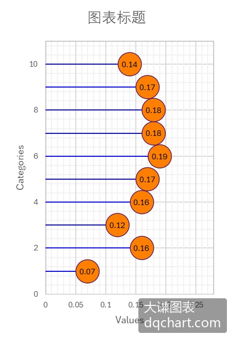
图3-9 编程绘制棒棒糖